Earlier this year, LinkedIn launched a lab project they’ve called LinkedIn InMaps. According to the post on their blog,
InMaps is an interactive visual representation of your professional universe that answers all of the above questions. It’s a great way to understand the relationships between you and your entire set of LinkedIn connections. With it you can better leverage your professional network to help pass along job opportunities, seek professional advice, gather insights, and more.
Ali Imam, Senior Data Scientist at LinkedIn, shared with me some thoughts behind the release of InMaps:
We get asked a lot, “What does a professional network look like?” We’ve been working hard to find a way for our members to not only visualize and showcase their professional universe, but offer new ways for people to visually interact with their network. Beyond the hours you can spend just looking at your InMap, it shows you how you’re related to your connections, offer insights about key influencers in your connections, and show you where to fill in gaps across your professional history and career. Ultimately, we hope it will help navigate and create opportunities for our members, whether it’s for themselves or people they are connected to.
Taking A Closer Look
Since we all use LinkedIn as an excellent resource for finding candidates (or so we say), I decided to check this out and evaluate it from a sourcer’s perspective. Thankfully (or maybe not?) I have only 2,778 first degree connections, so I was able to run my InMap. Several of you who are Open Networkers may find that you are not be able to run your InMap. I did ask LinkedIn about this, and while they didn’t share a specific ‘cut-off’ number with me, they did assure me that their product is designed to support the majority of users and that they are always iterating on their products and evaluating better ways to make them available.
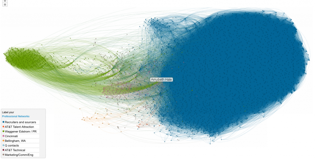
Here is what my InMap looks like, from a birds-eye view (click on it for a larger view):
As expected, the majority of my network seems to be classified as either corporate recruiters, 3rd party recruiters, or sourcers. Here is a break-down of how my network is structured:
- The blue dots all seem somehow related to recruiting. Some are former co-workers and peers (like SearchPath and MRI folks), whereas the majority are recruiting colleagues from either corporate or 3rd party backgrounds. However, there are some “rogue” connections there: for instance, Scott Ginsberg, AKA The Nametag Guy, is a blue dot. He has nothing to do with recruiting.
- The orange dots are former AT&T coworker connections, mostly those who work in a recruiting or HR capacity. It’s curious to me that they’re not included in the blue dots, even though they are situated close to them.
- The dark purple dots are also AT&T connections but more of the technical or non-recruiting related connections.
- The green dots are people I either used to work with at Waggener Edstrom or my social media and PR contacts.
- The pink and the yellow dots are people who live in cities where I either used to or currently reside.
- The light blue dots are people with whom I used to be in business.
- The gray dots are mostly marketing, communications, or engineering contacts. This seems to be my “catch-all” bucket also, because there are some other random folks contained in this group.
LinkedIn confirmed for me that the location of the dots in relation to different colored dots indicates a certain level of increased connectivity. So for example, if you have different colors intermingling, that means they are well connected with each other. On the other hand, groups that are placed farther away from others indicates that there isn’t much connection between them and the rest of the network. “The placement of the dots and the closeness of the clusters to each other shows hyper connectedness among individuals,” said Imam. “So if you see different colored clusters that are closer to each other it means that those connections intermingle and are associated with multiple groups. The clusters that are disparate from each other shows less interactivity among the connections in the clusters. ”
What You Can Learn From Your Map
Some things I believe you can tell through looking at your InMap is how you have developed your network. You can also get an indication of how you personally are using LinkedIn. For example, if you are a recruiter and the majority of your connections are recruiters, then your network structure might indicate that you are using LinkedIn as more of a learning tool — hence, your connection to your peers as opposed to people who work in the industries in which you recruit. OR — it could mean that you are connecting to other recruiters to gain access to their first degree connections, you moocher! 🙂
In analyzing my own network, I can tell you that when I first started using LinkedIn back in early 2005, I connected mainly with others in the recruiting world. So I started out using LinkedIn as a way to learn from my peers and co-workers. As time went on, I made more connections within the industries in which I worked — hence, the noticeable green, gray, and dark purple dots, which are areas in which I recently focused as a sourcer. Now, of course, as Editor of both SourceCon.com and FordyceLetter.com, the connections I made early on with recruiters are quite valuable in my network; I would say even more so now than the PR, social media, and technical contacts. Could that change? Of course. Our networks grow constantly and change shape and focus.
What I did NOT expect was how siloed these groups would be. Looking at the distance between the blue dots and the green dots, they almost look as though they are running away from each other. This tells me that 1) not many of my recruiting colleagues either work in PR or are connected to PR professionals, 2) that not many of my PR and social media connections link with recruiters, or 3) that I am simply not connected with the recruiters to whom my PR and social media folks are connected. Which makes me wonder — if your network also looks like this, and if we are supposedly using LinkedIn for “recruiting,” why are there not more visible connections with those who work in the industries in which we recruit? I’d be interested to hear your thoughts on this.
I did notice one glaring flaw (at least, from a sourcer’s perspective): there is no search function within the InMaps tool. LinkedIn confirmed this but added that it was a great suggestion so hopefully we’ll see a search field there soon.
In conclusion, from my perspective there isn’t really much applicable sourcing use for InMaps. It’s a visually appealing tool, and it has the potential to show you where your network is siloed as well as where you have intermingling connections. You can pick out individuals who are good connectors and also pinpoint areas for growth for yourself. But I wouldn’t spend any time trying to figure out how to actually ‘source’ with InMaps. Its value is in the visualization of your connections.
If you do decide to check it out for yourself (if your network’s not too big, that is!), take a screen shot of your network or post a link to it here. I’m curious to see how other sourcers’ and recruiters’ networks are structured. Perhaps we can learn something from one another in this sense. Happy Sourcing!

